The opportunity
Buying a home is one of the largest financial decisions most people make and one of the worst-designed experiences in the consumer market. Listings live in one app, mortgage rates in another, neighborhood data in a third, the agent on WhatsApp, the inspection report in a PDF, the closing timeline in someone's head.
The big PropTech players, Zillow, Redfin, Opendoor, all compete in the same Red Ocean: speed, scale, price, predictive data. They're great at automation. They're terrible at belonging.
Catchouse came to Yummy Labs with the opposite bet: a human-centred, emotion-driven real-estate platform focused on belonging, lifestyle, and discovery instead of price and specs. Their tagline crystallized the thesis: "We don't just find homes. We help you find where you belong."
I joined the 2-week Yummy Labs sprint as the founding designer for the experience.
The problem
A lot of strategic groundwork was waiting to be turned into product. Catchouse needed an experience that was the belonging promise, not just a product that talked about it. And it needed to do that in a category where AI giants are bolting on "AI home advisors" fast enough to scale emotional discovery cheaper than a small team ever could.
The strategic risk: if Catchouse just looked like Zillow with prettier copy, the niche would close in months. The design problem: turn the belonging thesis into a real product surface that AI-automated competitors couldn't easily replicate.
How I worked
The 2-week sprint had its own rhythm. Yummy Labs runs a hybrid model where AI tools (Figma Make for prototyping, an AI workspace for synthesis) are part of the workflow, paired with a human UX coach embedded throughout. That structure shaped the whole process. Here's how the work actually unfolded.
1. Setup, frameworks, and secondary research
Days 1–2 went to landscape work, not pixels. The Catchouse founder vision was bold but loose; before I could design anything, I needed to know what category I was even in.
I ran three strategic frames in sequence:
- STEPIC / STEEP / PESTEL to map the macro environment, what's happening in PropTech, demographics, regulation, tech, that opens (or closes) opportunity
- Porter's Five Forces for competitive pressure, where the moats need to be
- Blue Ocean Strategy for positioning, where Catchouse can play uncontested instead of fighting Zillow head-on
The Blue Ocean value-curve was the breakthrough. Catchouse needed to raise emotional intelligence + community + human touch; reduce automation obsession + transactional focus + data commoditization; create a hybrid AI + human-storytelling model; and eliminate generic listing search as the differentiator.
That gave me the brief in one line: own the emotional-discovery niche where data meets feeling.
2. Sharpening the brief
Day 3 was about turning a messy founder vision into a sharp, testable design challenge. I worked through four artifacts in parallel:
- Design + product challenge breakdown so the founders and I were solving the same problem
- Problem statement draft in plain language
- Primary persona (we anchored on a buyer named "Priya": early-career, mobile-first, exploring new neighborhoods, weighing lifestyle as much as price)
- Business goal translated into a measurable KPI
The output was a one-pager the founders signed off on. From this point forward, every design decision had to defend itself against this brief or get cut.
3. Mapping the journey, then zooming in
Day 4 moved from abstract strategy to concrete user scenarios. I mapped the as-is homebuying journey end to end, the steps existing PropTech serves and (more importantly) the steps it under-serves. The under-served steps became opportunity zones, candidate areas where Catchouse could differentiate.
From those zones I drew zoomed-in user flows for the prototype's most important moments: intent capture, neighborhood discovery, the lifestyle preview, the shortlist. The flows are what the prototype is built on.
4. Lo-fi wireframes, locking the structure
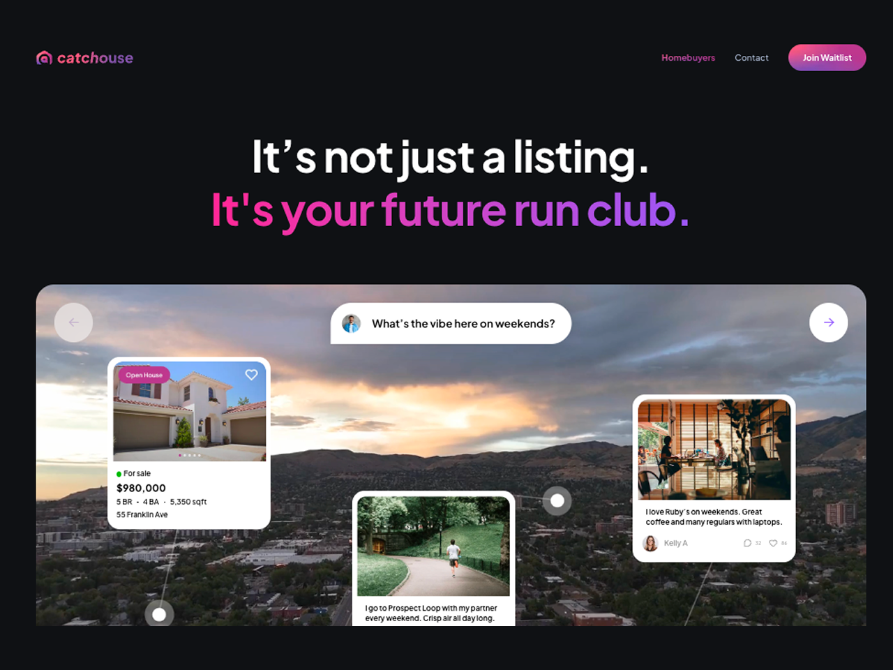
Day 5 was structural, not visual. I sketched lo-fi wireframes that locked the IA: neighborhoods → vibe → homes, in that order. Listings sit inside a neighborhood. Neighborhoods sit inside lived perspectives. The order matters; reverse it and you're back to a Zillow clone.
Lo-fi was deliberately ugly so the structure was the only thing being evaluated. Once it held up, I had permission to go hi-fi.
5. Hi-fi prototyping in Figma Make, non-AI vs AI drafts
Days 6–7 were the AI-assisted hi-fi build. Yummy's methodology pairs two drafts in Figma Make before converging:
- TRIAL 1, contextual non-AI draft, the prototype I'd build the traditional way, working from wireframes
- TRIAL 1.5, contextual AI-augmented draft, the prototype Figma Make's AI helped generate from the same brief, plus my refinements
Comparing the two side-by-side surfaced moves I would have missed working in either direction alone. The biggest one: the "Day in a Neighborhood" feed, a day-in-the-life preview of a place (morning run through nearby parks, the coffee shop locals love, the lunch spot, the evening community vibe), with homes appearing as the place that completes the day. Lifestyle as the discovery axis.
I converged the strongest moves from both into a single experience prototype. That was TRIAL 1, the version I took to user testing.
6. Testing with 7 real people
The point of a prototype is to find out what's broken. I ran a structured test with 7 participants (Aakash, Shriya, Mihir, Shreya, Dhwani, Pradeep, Rita), early-career professionals aged 25–40, mobile-first, exploring new neighborhoods in the US.
For each session I captured: a session summary (role/context, not names externally), key observations, evidence (screenshots, quotes, short notes).
What worked:
- The lifestyle-first concept landed. Users loved exploring vibe before listings.
- "Day in a Neighborhood" felt fresh and inviting, exactly the differentiator we needed.
- Persona-naming and tone ("Hi Priya") made the product feel personal without being intrusive.
What broke:
- Mock pricing and location data felt unrealistic in places (trust dropped immediately)
- Filter and sort affordances were missing or hard to find
- Map coverage and zoom were limited
- "Day in a Neighborhood" needed richer imagery, parks, EV chargers, grocery, theaters, to actually deliver the lifestyle preview
The synthesis was unambiguous: users wanted the lifestyle bet to land. They were stopped from believing it by trust and context gaps, not by the concept itself.
7. Refinement and TRIAL 2
Days 8–10 went to refinement based on the test findings. Carmen, the Yummy Design UX coach, was embedded in the workflow on Discord and gave me the feedback that pushed the second iteration the most:
- "Reframe as neighborhoods first, then homes."
- "Call her by her name. Give her places she can pin within a neighborhood."
- "Make the day-in-life feel really hers."
- "If you ask a few more questions up front, you can really personalize this with cool videos and images so she can see herself there."
Top changes I integrated into TRIAL 2:
- Filter & sort bar (price, lifestyle, commute) elevated to the primary surface
- Expanded map coverage with zoom
- Photo galleries inside Day in a Neighborhood for genuine lifestyle context
- Region-aware location labeling (the test build mis-labeled a Bangalore region for US data)
- Lifestyle tags: gated, pet-friendly, walkable
- Persona-pinned places so neighborhoods felt owned, not just browsed
- A clearer top-level message: "You're exploring neighborhoods, not listings."
TRIAL 2 was the version that survived as the founder-ready prototype.
8. Developer-ready handoff
The last days went to handoff. Yummy's principle: the file should be developer-ready, meaning anyone (engineer, PM, or AI tool) could open it and understand how to build from it without asking ten questions.
I organized and annotated the Figma file, documented the decisions and edge cases, and translated the design into something buildable. By end of week two, the founder team had a complete experience prototype, a coherent design language they could brief future hires on (eng, brand, content), and a build-ready Figma file.