Marketers ran campaigns across a dozen platforms and stitched the numbers together by hand. Decisions got made on stale data, by gut, after the fact.
✓What I shipped
Strique unified the data. The AI Summary turned what the marketer was looking at into what she should do next. The substrate I designed in 2024 is what 2026’s autonomous platform now runs on.
What I ownedResearch, IA, every product surface, the design system, prototyping, usability testing, the Shadcn proposal, the atomic rebrand, and mentoring the team’s design intern.
✶ Live prototype
Try it
The Monday-morning flow — open the dashboard, customize widgets, read the AI Summary, share with leadership.
↯ Click into the prototype above, fully interactive.
What Strique was
In 2024, Strique was a decision-support tool for D2C marketing teams drowning in data — a unified layer above the dashboards, not a dashboard itself. I designed it inside a continuous loop with research, dev, and the CEO. The work survived a full product pivot.
When I joined in 2023, the performance-marketing stack looked like this: one tab for Meta Ads, one for Google, one for Amazon, one for Shopify, one for GA4, and a shared Google Sheet trying to hold it all together. Vatsal and Poojan, the founders, wanted to replace that chaos with a platform built by marketers, for marketers — not another dashboard, but a decision system with AI doing the heavy lifting underneath.
By 2024 the category had split in two. Some tools moved data from one place to another; some turned data into decisions. Ad platforms were getting opaque. Attribution was getting harder. AI-driven insight was about to go from buzzword to baseline. Strique was built to take the decision layer — and nobody had won it for mid-market D2C brands.
Strique’s home dashboard — headline metric on the left, AI Summary beside it.
How we worked
This is the part most case studies skip, so I’ll start here.
There was no design phase, then a dev phase, then a handoff. There was a weekly call with the CEO, ongoing conversations with the CTO about feasibility, two performance marketers using mid-fi prototypes as their real workflow, and seven engineers shipping against the design system in the same sprint I built it. Research never ended. Audits never closed.
The loop ran on three rules. One: the people who would use the product were in the room before the wireframes. Two: the people who would build it were in the room before the design system. Three: the CEO heard about tradeoffs when they were tradeoffs, not when they were finished decisions.
The Shadcn proposal — which collapsed our handoff problem — didn’t come from me sketching in private and presenting a recommendation. It came out of a conversation with the CTO during a research review. That’s the loop doing its job.
The research arm ran continuously. Two weeks of secondary scans before any Figma file — performance-marketing tools, agency workflows, Reddit threads where marketers complained about their stack. Then audits of the existing Strique surfaces and the cross-platform stack our users were juggling. Then benchmarks against Polar Analytics, MadgicX, Revealbot, Agency Analytics — they had power; most had cluttered interfaces, steep learning curves, and none were leading with AI. That gap became the product thesis: a decision-first, AI-driven, human-centered approach to analytics.
Early research — secondary scan of the performance-marketing landscape and agency workflows.Early research — Reddit + community threads, where marketers describe what their stack actually looks like at 9am Monday.User insights — what marketers actually do at 9am on Monday, and the data missing from those decisions.Audit — existing Strique surfaces plus the homemade Sheets stitching the cross-platform stack together.
✶ Inline prototype
Walk through the old system
The pre-redesign Strique surfaces I designed against — cluttered dashboards, fragmented integration flows, metrics-heavy reporting.
↯ Click into the prototype above, fully interactive.
Benchmarking — Strique vs Polar Analytics, MadgicX, Revealbot, Agency Analytics.Persona — the time-constrained, data-rich, insight-poor e-commerce marketer Strique was built for.
The product arm ran alongside it. I mapped every flow before drawing a screen — onboarding, integrations, AI-summary generation, reporting, the catalog. Dependencies between features, data sources, and model outputs. Edge cases — when the AI is wrong, when data is sparse, when integrations break — stress-tested before they ever became code. The IA underneath was built around marketer mental models, not tool categories: reports first, dashboards second, integrations as a tray.
User flow — master flow from onboarding through reporting, including the AI-summary loop.User flow — Smart Insights generation and the recommendation surface, with confidence and override branches.Information architecture — top-level structure organized around marketer mental models.
The notes never went into a slide deck. They went on a working wall — themes clustered, recurring quotes elevated, the five repeating problems made into design briefs of their own. The team was at that wall with me.
Brainstorming with the team — synthesis wall, recurring quotes elevated, problem statements written.Team calls — cross-functional reviews where AI-trust trade-offs got argued in the open.
✶ Inline prototype
Open prototype
Lo-fi exploration with the team. Devs were in the room for these too.
↯ Click into the prototype above, fully interactive.
The substrate
Inside that loop, I designed the substrate: the widget system, the AI Summary layer, the report shell, and the design system. None of these were deliverables. They were the loop’s running output.
The substrate had to do three things at once. It had to let a non-analyst marketer build her own report without writing SQL. It had to surface AI recommendations in a way she would trust. And it had to be a system, not a catalog — engineers had to be able to ship a new pattern without asking me about it first.
The decision-first pattern got locked in lo-fi before it got polished. Headline metric on the left, AI-recommended action beside it, supporting detail one click deeper. Power users took an extra minute to find customization. New users had something to act on in the first thirty seconds. The call I’d make again.
Wireframes — decision-first dashboard layout with the AI-recommended action beside the headline metric.Wireframes — Smart Insights surface and reports view, with confidence + override patterns sketched in.
The hardest design problem on the platform was Smart Insights — Strique’s AI-summarized reporting module. Years before the rest of the category caught up to AI summaries, we shipped a feature that took data from 20+ marketing platforms and distilled it into three lines and a recommendation. Designing it meant solving for AI-trust at the interface level: how confident should the model sound, when should it flag uncertainty, what does an AI-generated insight look like next to a human-set goal. The principle I held the line on: the AI summarizes and recommends; the marketer decides. The interface had to make that hierarchy obvious every time.
The demo below is the live React + Shadcn build. The product team used it as the working spec — engineering shipped against this, not against a Figma file.
✶ Inline prototype
Open prototype
The Monday-morning flow, built in React + Shadcn. Engineering shipped against this — not against a Figma file.
✶Click in to interact · scroll within the frame to explore
↯ Click into the prototype above, fully interactive.
Strique UI — Smart Insights surface, the AI summary that distills 20+ data sources into three lines and a recommendation.Strique UI — integrations and cross-platform stitching, sync states, and the workspace-level connector tray.Strique UI — reports and drill-down, with AI-generated narrative running alongside the chart.
By mid-2024 Strique had outgrown its original identity — new clients, new pricing tier, more AI features in flight. The clean-looking path would have been a stop-the-world redesign: two sprints, one new version, ship. I rejected that. Shipping chaos compounds in a fast-moving SaaS; a two-week blackout is six months of lost roadmap momentum, especially when AI features are still shipping weekly. So I led the rebrand atomically — tokens first, then components, then templates, rolled out incrementally behind the scenes. The cost was six weeks of subtle inconsistency. The benefit was zero disruption to the roadmap. From the outside, Strique just kept looking more and more like itself.
Atomic design system principle — tokens, components, templates, organized so a single token swap re-skins the surface.Design system, final — color, typography, spacing, components, templates.
Three decisions
Three moments where I held the line against an easier alternative.
How we triaged — Impact and Effort, against the alternatives.
01 · Decision-first dashboard, not a BI wall. The default for analytics products is to show everything. We shipped the headline metric on the left and the AI’s recommendation beside it. The full breakdown lived below the fold, accessible but never first. Marketers told us this was the moment Strique stopped feeling like a tool and started feeling like a partner.
✶ Inline prototype
Open prototype
The dashboard, before and after the decision-first move.
↯ Click into the prototype above, fully interactive.
02 · AI recommends, the marketer decides. Smart Insights surfaced opportunities, but never executed them. Every recommendation came with reasoning shown — what data point triggered it, what action it suggested, what we weren’t sure about. Trust gets built when the model shows its work.
03 · Shadcn as the team’s vocabulary, not Figma. The hardest decision. I proposed we adopt Shadcn as the source of truth for components — meaning my Figma library would mirror Shadcn primitives, not the other way around. Engineering owned the shared vocabulary; I designed against it. The next section explains what this did.
The handoff that wasn't
Most teams treat design-to-engineering handoff as a moment. Ours stopped being one.
Before and after — what shipping a new pattern used to take, and what it took once Shadcn was the shared vocabulary.
Before Shadcn, a new pattern took about a day end-to-end — design it, write the spec, sit with engineering, watch them rebuild the primitive from scratch because “Card” in Figma wasn’t quite “Card” in code. After Shadcn, the same pattern took about three hours. The vocabulary was shared, so the work collapsed into composition instead of translation.
Six widget patterns shipped in the time the old workflow shipped two. The real win wasn’t speed though. It was that engineers could now propose patterns back to me with confidence — the loop got tighter because the language got common.
Outcomes
The customers we worked with — by name, not aggregate.
Customer outcomes — Addison Lee, CottonWorld, and the daily savings figure.
Addison Lee, the UK ride-hailing brand, used Strique’s decision layer to restructure their performance marketing. Their leads increased by 492%, their cost per lead dropped by 71%, ROAS climbed 360%, and click-through rate improved by 48.6%. CottonWorld, an Indian apparel D2C, shifted their entire catalogue strategy on top of Strique’s insights — conversion rate up 21%, orders up 50%, catalogue sales up 174%.
The product saved the average marketing team roughly $150 and 3 hours a day, which compounded to $4,500 and 7 working days a month.
3,200+
Businesses growing with Strique
$4M+
Worth results generated for businesses
1.5x
Better ROAS than doing it yourself
0%
See sales growth in their first month
The most convincing validation didn’t come from our team. It came from a customer 11 months into using the product:
“I didn’t believe the hype at first as a seasoned e-commerce owner for more than 20 years. After installing it on the free trial, the results have been amazing. Revenue increased by 33% and the reporting has saved the team so much time. I love the AI aspect and I haven’t even started using all the features yet.” — Lilly & Sid, Founder & CEO, UK
That quote is still pinned to strique.io today. I check.
User testimonial — Lilly & Sid, the customer quote that became the most reliable validation.
Where it went
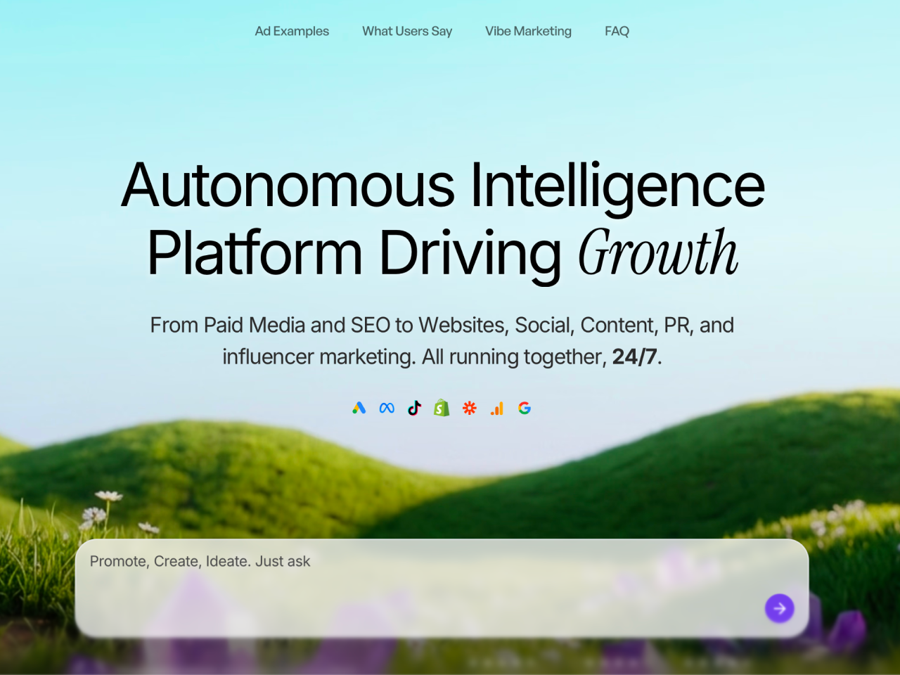
In 2026, Strique launched as an autonomous AI marketing platform — a “Virtual CMO” that briefs itself, runs campaigns, and reads its own results. The press calls it a new product. It isn’t, entirely.
Strique 2024 → 2026 — what I designed, what the autonomous platform inherited.
The autonomous platform reads from the IA I designed. Its agents speak the visual vocabulary of the design system. The reasoning-shown pattern from Smart Insights is now how the agents explain themselves. The decision-first dashboard layout is still the home screen. The brand framing — the language, the trust posture, the “we show our work” promise — was carried forward intact.
The product pivoted from decision-support to autonomy. The substrate didn’t. That’s the part of the work I’m proudest of: not that it shipped, but that it held up when the strategy changed underneath it.
Mentoring as work
Halfway through my time at Strique, we brought on Shreya Jain as a design intern. I owned her onboarding, her design reviews, our weekly 1:1s, and the gradual handoff of visual work so I could focus on systems, AI-feature design, and strategy.
The thing no one tells you about being the only designer at a fast-moving AI startup: your biggest force multiplier isn’t a better tool. It’s a second designer who thinks like you. Teaching Shreya the why behind each design choice, not just the what, meant the product kept its coherence even when I wasn’t the one drawing it.
The loop expanded to include her — research syntheses she ran, reviews where her instincts caught what mine missed, design crits with practitioners outside the company that I set up for her growth. By the end of 2024 she was the second voice in every system decision. The product still has her fingerprints on it.
Industry advisor sessions for Shreya — paired mentorship and external practitioner reviews built into her growth plan.Team calls — design reviews and weekly 1:1s where Shreya and I worked through trade-offs together.Team group photo — the people behind the platform, in the office where most of this work happened.
What I'd do differently
Three things, honestly.
I’d design the AI Summary as an audit trail from the start. We built it forward-only — every insight surfaced, none of them remembered. By 2025 it became obvious the team wanted history: which recommendations did we take, which did we ignore, what happened. I’d build that affordance from day one.
I’d test concepts on paper before Figma. Round one of usability testing caught a wrong assumption after two weeks of mid-fidelity design. The fix was cheap. The unwind wasn’t.
I’d be in the data-model conversation, not just the UI one. The accordion-in-table pattern would have shipped two weeks earlier if I’d understood query-shape constraints upfront. The front-end and the data model are the same surface — designers who treat them as separate concerns will be slower than designers who don’t.
✶ Thanks for reading
That’s the case study, front to back.
If you want to dig into anything I skimmed over, process, edge cases, the trade-offs that didn’t fit on the page, reply by email or send this to a teammate.