The Manu Times
Shipped · 2023

Zype · Shipped 2023

Zype

An Indian credit super-app that wanted lending designed for life-fit, not credit limits. A 4-week sprint at HumanX with $300K+ in loans disbursed through the redesigned flow.

Zype cover

At a glance

RoleUX Designer · 4-week sprint at HumanX
Timeline2023 · 4-week design sprint
DomainFinTech · Indian credit super-app · First-time borrower experience · B2C mobile lending
PlatformMobile-first · iOS · Android
TeamHumanX product design team in coordination with Zype's product + engineering leads

The problem

Zype's lending flow was modeled on credit limits, not lives, first-time borrowers couldn't understand what they actually qualified for, why, or what the loan would cost them in the months ahead.

What I shipped

I shipped a life-fit lending flow with progressive disclosure, plain-language eligibility, an upfront cost timeline, and a confidence-building review screen, designed for Indian first-time borrowers, not seasoned credit users.

What I ownedLending flow strategy · IA · User flows · Wireframes · Hi-fi UI · Eligibility surfacing pattern · Cost timeline component · Dev handoff

Live prototype

Try it

The shipped mid-fi lending flow, eligibility-first, plain-language terms, the cost-timeline component built from primitives. Tap into it inline.

Loading the prototype…
Open in Figma

Click into the frame · use ← → or the side panel to walk through screens

Embed not loading? Open it directly in Figma ↗

↯ Click into the prototype above, fully interactive.

The opportunity

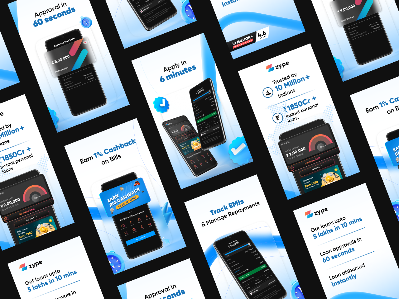
Zype is an Indian credit super-app, instant personal loans, BNPL, credit-on-call. The product had pulled in early users, but the core lending flow was modeled on the math a bank uses, not the questions a first-time borrower asks. "Can I afford this?" was being answered with "Your credit limit is ₹X.", two completely different conversations.

HumanX was brought in for a 4-week sprint to redesign the flow with an explicit brief: lending designed for life-fit, not credit limits. I owned the UX track.

The 4-week design process, research, IA, wireframes, hi-fi, handoff, with weekly stakeholder reviews

The problem

The existing flow optimized for the wrong audience. It assumed the user already understood credit, EMIs, processing fees, and the trade-offs between loan tenures. The actual user, a 25-year-old in tier-2 India taking their first formal loan, was asking different questions:

  • "How much can I actually borrow without it stressing my month?"
  • "What will I pay every month, in numbers I can plan around?"
  • "What happens if I miss a month?"
  • "What's this fee, and is it baked into the EMI or added later?"

The flow had answers for all of these, buried under jargon. The design problem was making them load-bearing.

How I worked

1. Research, interviews + funnel-drop analysis

Week 1 went to research. HumanX paired me with the Zype product team for borrower interviews, plus a deep dive into the flow's funnel-drop analytics. Two patterns showed up immediately:

  • Eligibility was the silent killer. Users who didn't qualify for their requested amount got a generic decline. Most never came back.
  • Cost surprise was the loud killer. Users who completed eligibility were re-bouncing at the terms-and-fees screen because the all-in cost wasn't visible until the second-last step.
Initial research, interview themes from first-time Indian borrowers, mapped against funnel-drop analytics

2. Jobs-to-be-done, what borrowers were actually hiring the flow for

I clustered the interview signal into JTBD statements. "When I apply for a loan, I want to know what I'll pay every month, so I can plan around it without surprises.", patterns like this became the brief for every screen.

Jobs-to-be-done, primary borrowing JTBDs reframed in user language
Jobs-to-be-done, the secondary set covering decline states, repayment confidence, and cost transparency

3. Use cases, what each persona walked through end-to-end

Two use cases drove the flow design, a confident first-time borrower applying for a salary-backed loan, and a wary second-time borrower returning after a missed EMI. Both surfaces had to be the same flow with different supporting copy.

Use case 1, confident first-time borrower, salary-backed loan, eligibility-first entry
Use case 2, wary returning borrower, post-missed-EMI re-entry with cost transparency upfront

4. User journey + information architecture

The redesigned flow followed a different shape: eligibility-first, then a personalized terms screen, then a cost timeline, then a review. Decline states became actionable (here's what would qualify you instead), not dead ends.

User journey map, the as-was flow with funnel-drop hot spots flagged in red
User journey map, the to-be flow with eligibility-first entry, personalized terms, cost timeline, and recoverable decline states
Information architecture, every screen, every decision branch, every data dependency, mapped to the loan product

5. Wireframes, locking the structure before pixels

Wireframes locked the most important pattern: a cost timeline component that visualized monthly outflow over the loan tenure, with the EMI, processing fee, and any prepayment penalties laid out month-by-month. No more cost-surprise.

Inline prototype

Walk through the wireframes

Click into the wireframe prototype that locked the IA and decision tree before any pixel got a colour. This is the version I pressure-tested with the Zype team.

Loading the prototype…
Open in Figma

Click into the frame · use ← → or the side panel to walk through screens

Embed not loading? Open it directly in Figma ↗

↯ Click into the prototype above, fully interactive.

6. UI, the shipped flow

Hi-fi rolled out in week 4 with the Zype design system extended where needed (the cost-timeline component was new, so I built it from primitives). The shipped mid-fi prototype is at the top of this page, try it.

The outcome

$300K+

Loans disbursed via the redesigned flow

in the launch window after the 4-week sprint shipped

0

Week design sprint

research → IA → wireframes → hi-fi → handoff, with weekly stakeholder reviews

0

Core lending flow rebuilt end-to-end

eligibility → terms → cost timeline → review → confirmation, every step rewritten

The redesigned flow shipped at the end of the sprint and disbursed $300K+ in loans in the launch window. The cost-timeline component became a permanent part of the Zype product surface; the eligibility-first pattern reframed how subsequent loan products were designed.

Reflection

Two things this sprint taught me.

1. FinTech defaults are usually banker defaults. "Credit limit," "available headroom," "processing fee netted at disbursal", every term is correct, none of them survive contact with a first-time borrower. Designing for life-fit meant rewriting the language as much as the layout.

2. A 4-week sprint can ship a load-bearing pattern. The cost timeline wasn't a screen; it was a reusable unit the broader Zype team could extend into BNPL, credit-on-call, and future products. The win wasn't the loans disbursed in the launch window. It was the pattern that kept earning after the sprint ended.

✶ Thanks for reading

That’s the case study, front to back.

If you want to dig into anything I skimmed over, process, edge cases, the trade-offs that didn’t fit on the page, reply by email or send this to a teammate.

✶ Read next