The opportunity
Ask a 22-year-old in a tier-2 Indian city how to enter politics, and the answer is usually: "Be born into it." Or: "Know someone." Or: a silence.
India's political ecosystem had, and still has, a structural gap for youth. Motivated young people curious about governance had no good way to learn. Informal training cost money most didn't have. Formal pathways didn't exist for first-generation aspirants. And the loudest voices online were the least reliable.
I-PAC set out to build the missing rung: a trusted, structured, accessible platform where young Indians could learn politics, find mentors, and build a real path into governance. A 3-week sprint. Mobile and desktop. Multiple Indian languages down the road.
That was the brief. The research made it personal.
The problem
Three weeks doesn't buy you exploratory research. It buys you fast research with a sharp funnel. I ran two tracks in parallel.
- Secondary: Youth participation studies, UN civic-engagement reports, Indian policy framework reviews
- Primary: 100+ offline interviews · 300+ online survey responses · field observations in rural, semi-urban, and urban settings · heuristic evaluation of existing civic tools · competitive analysis
400+ voices in three weeks. The pattern that emerged across all of it:
- Limited access to any meaningful political training or mentorship
- Lack of clarity about political processes, even basic ones, like how a candidate actually files for an election
- Low trust in institutions, and in any platform that claimed to teach about them
- Region-specific complexity, what works in Tamil Nadu is not what works in Uttar Pradesh
- Cognitive overload, the internet is drowning in political information, none of it structured for learning
Young Indians weren't disengaged. They were under-served. The design problem wasn't "make politics interesting." It was "make politics navigable."
How I worked
1. Double Diamond, compressed
The Double Diamond (Discover → Define → Develop → Deliver) was the structural frame, compressed into three weeks. Week 1: research and synthesis. Week 2: IA, flows, wireframes. Week 3: final UI plus prototype plus user testing.
What the framework bought us wasn't the method, it was forcing honesty about what we were doing at any given moment. In a 3-week sprint, the temptation to bleed research into design (or vice versa) is enormous. The Double Diamond made it obvious when we'd slipped.
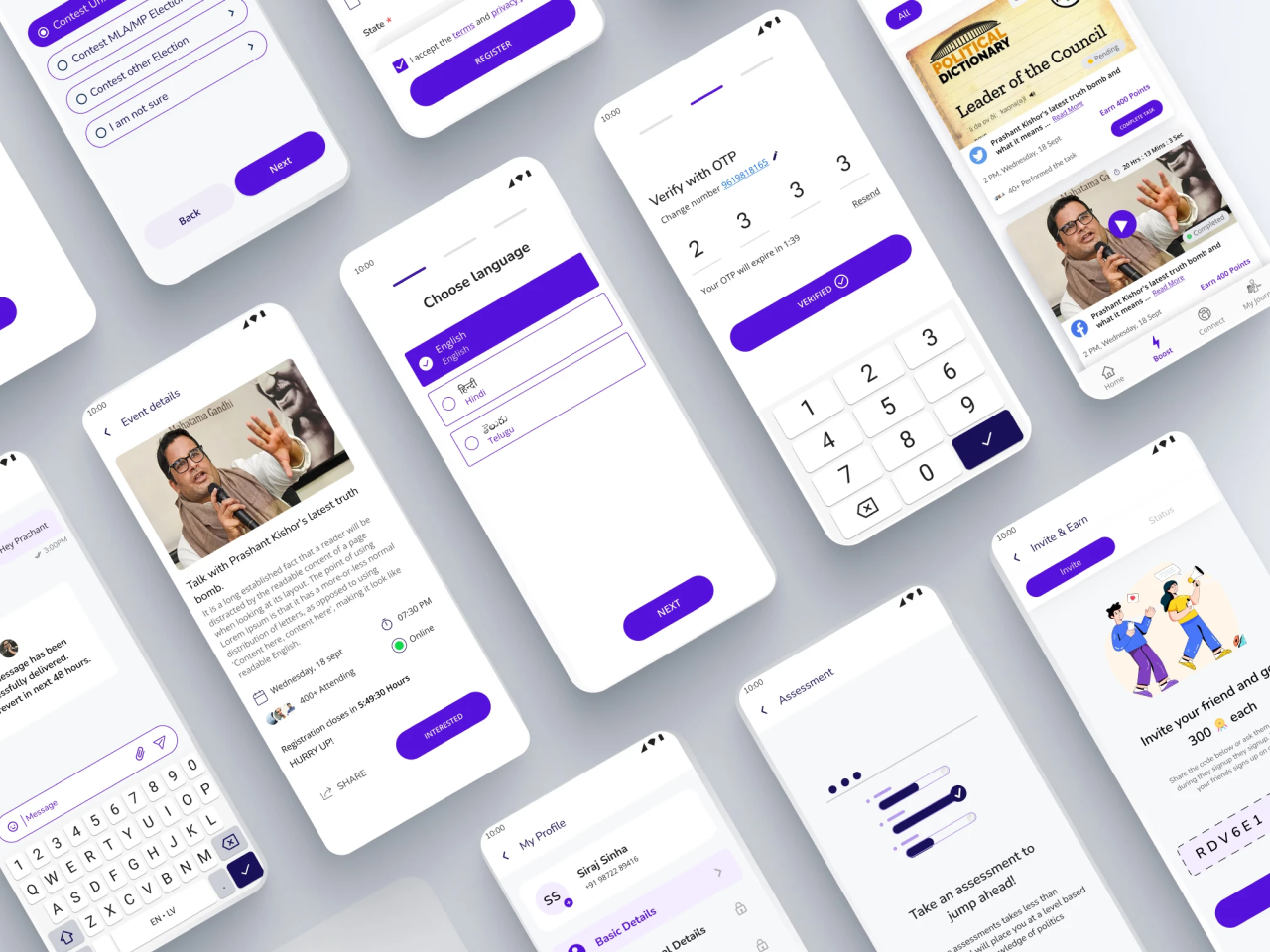
2. Information architecture, relevance-first
The defining insight from the research: young Indians weren't intimidated by politics. They were intimidated by how politics was explained. Existing civic tools simplified by removing context, "how to vote in 5 easy steps," which read to users as condescension. They dropped out.
Our thesis flipped the default: simplification isn't about removing information. It's about structuring it for confidence. A 22-year-old entering politics for the first time doesn't need shorter sentences, they need a map.
That translated into concrete design moves:
- Relevance over volume. The IA surfaced what was relevant to you (your state, your interests, your stage) before anything else
- Hierarchy, not dumbing-down. Complex topics got fuller treatment with context, not shorter versions
- Progressive disclosure on trust. The platform earned reader trust incrementally: who vouches for this content, who's the mentor, where does the information come from
The trade-off: slower onboarding, more scaffolding, more engineering. The alternative, a "simple" tutorial flow, would have felt condescending and churned the motivated users we most needed.
3. Mentorship as the product, not the feature
The single biggest engagement driver, from user testing and post-launch data: mentors.
Not the curriculum. Not the gamification. Not the community. Real human mentors, with verifiable political experience, matched to learners by region and interest. The curriculum was the entry ramp. The mentor relationship was what made users come back.
I redesigned the IA mid-sprint around that insight. The mentor wasn't a feature buried three taps deep, they were present from the home screen, accessible, named, and visible. Every learning unit was anchored by "here's who'll guide you through this."
That call was the highest-leverage decision in the whole sprint. It's why the platform worked.
4. Wireframes, locking the structure
Wireframes locked the relevance-first home, the mentor card pattern, and the progressive-disclosure trust ladder.
5. Visual identity, credible and approachable
Civic products usually look like government websites: institutional, gray, cautious. Or they look like gamified tutorials: cartoonish, condescending. YIP needed to sit between, serious enough that a 28-year-old considering running for office trusts it, approachable enough that an 18-year-old curious about politics doesn't bounce.
The visual system: generous typography, muted institutional palette with one confident accent, illustration used sparingly for narrative moments (not decoration). Credible without being stiff.
The outcome
Three weeks of design, launched within I-PAC's 2022 cycle.