The opportunity
Kerala reads Malayalam. 40 million speakers worldwide, the highest literacy rate in India, and a media culture where the morning paper still matters. Manorama News, the TV channel launched in 2006 and operated by MMTV under the century-old Malayala Manorama group, is where Kerala gets its news. For a decade and a half, the TV-first experience was leagues ahead of the digital one.
When HumanX took on the project in June 2022, manoramanews.com was a broadcaster's afterthought: a scrolling wall of headlines, inconsistent across devices, weak on the mobile web where Kerala actually reads. The OTT streaming app had a parallel problem, a great library with a confusing front door.
The opportunity wasn't to make the site look modern. It was to design for how Kerala actually consumes news in 2022: on the phone, in Malayalam, during a commute, while also wanting to switch to live TV when something breaks.
The problem
The brief said "redesign everything." That's not a brief, that's a wishlist. My first job was to turn it into a problem I could actually solve.
Stakeholder interviews with newsroom editors, producers, broadcast leadership, and the MMTV digital team surfaced a pattern the brief had missed. The news site and the streaming app weren't just outdated, they were two products fighting each other. Editors wrote headlines for TV and reused them online. The streaming app assumed you'd already decided to watch, but discovery was broken. The mobile web was the majority of traffic but designed like a desktop page that happened to shrink.
The actual problem, once I could see it:
- The newsroom and the digital team worked on different rhythms. TV-first editorial norms didn't map to web-first content patterns.
- Malayalam typography was treated as "English but different glyphs." Line height, font scale, and column widths ignored how Malayalam actually reads.
- The OTT app assumed intent. It was great once you knew what you wanted. It was brutal when you didn't.
- Four surfaces, no shared design system. Every surface had its own spacing, its own components, its own drift.
Kerala's readers weren't short on news. They were short on a news product that respected their language, their device, and their attention.
How I worked
1. The newsroom as my first user
The instinct at a design agency is to start with end-users. I went to the newsroom first.
Talking with editors and producers as they put together the broadcast rundown changed how I framed the whole project. What I learned: the digital product wasn't failing because the design was bad. It was failing because the editorial workflow ended at broadcast, and the web got whatever was left over.
That reframe changed everything. The redesign couldn't just be a new UI. It had to be a system that respected the newsroom's rhythms, making it easier for editors to treat digital as a first-class surface, not a post-broadcast leftover.
2. Understanding the Malayalam reader
Parallel track: I spent time with actual readers. Mobile-first behavior was the headline (majority of traffic came from phones), but the specifics were the interesting part.
- Malayalam headlines run visually wider than English, same character count, more horizontal space
- Readers scanned in short bursts between other tasks; depth-reading was rare
- Breaking news drove session spikes, but staying to read more was the exception
- A meaningful chunk of the audience switched to live-TV video inside the session
That last insight unlocked the architecture: the web, the responsive mobile site, and the OTT app shouldn't be siloed experiences. They should be three entry points into the same story stream, with a clean handoff between text and video.
3. From research to information architecture
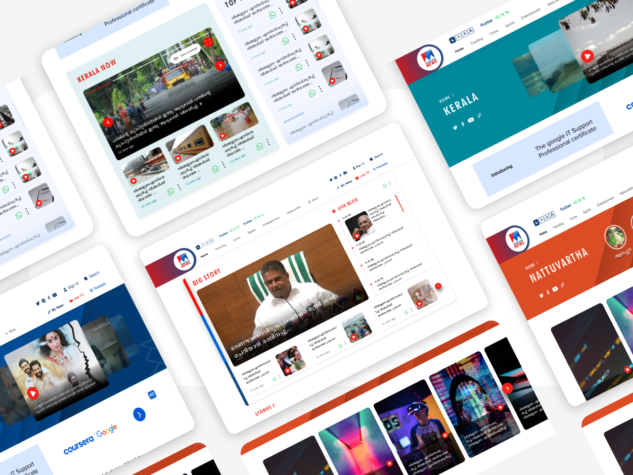
The four-surface architecture came out of the research, not the brief. Live TV as a first-class home-screen object, three entry points into the same story stream, image-first card design, every IA call traced back to a Kerala-specific reader behavior we'd documented.
4. Wireframes, locking the structure across four surfaces
Lo-fi first. The story-card pattern, the live-TV slot, the section folio, all locked at the wireframe stage so the visual layer didn't have to renegotiate the architecture.
5. Designing across four surfaces, with one system
Four surfaces: desktop web, tablet, mobile-responsive web, and the OTT streaming app. A clean-slate redesign of each would have been fast for the design team and expensive for everyone else. The alternative, one shared design system with surface-specific templates, was slower to set up and dramatically cheaper to maintain.
I built the system the hard way: tokens first (typography scale tuned for Malayalam's metrics), then components (story cards that worked at four breakpoints), then templates (category, article, live-stream, category landing). The OTT app got its own branch of the system for the video-first interactions, but shared tokens with the web.
The trade-off: weeks of system work before any "final" screens could be shown. The win: when review moved from the first surface to the next, most of the design was already decided.
6. Designing for the Kerala context
Three decisions specific to Malayalam news in Kerala:
Live TV as a first-class citizen. Unlike a Western news site where live video is a side panel, we put it at the top of the mobile site, persistent and mutable. Kerala readers wanted to hear a breaking story as often as they wanted to read one.
Vernacular typography, done properly. A type scale built around a paired Malayalam display face plus a more neutral text face, with line-heights tuned for descender-heavy scripts. Characters that had been cramped in the old site could now breathe.
Image-forward cards for a visual culture. Malayalam news is visual: weather, festivals, politics, sport. Every card in the new system had a generous image aspect ratio and image-first priority. The headline got the typographic attention. The image got the real estate.
The outcome
The 2022–2023 engagement shipped a redesigned manoramanews.com across desktop, tablet, and mobile-responsive, plus the OTT streaming app.